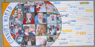
When Connor was a year old, I wanted to make summary pages for several months of activity. At the time, I was a tax accountant and one of the magazines that was routinely on my desk was the Journal of International Taxation. The cover of that magazine just happened to always have a globe overlay on its cover. I knew I wanted to make it into a layout, but it took me a while to figure out how I'd do it. Then the layout itself, well, by the time I did all of the work in PSE to make the template shapes, sized the photos, cut and assembled them, pretty darned near took forever.
First, I traced the globe from the magazine onto light tracing paper.
Then, I scanned the drawing and used PSE (1.0!) to make 1/4 of the scan a little larger than 6 inches in radius.
After I got it the size I wanted it, I printed out the 1/4-sized globe. Next, I cut out the pieces out of paper and transparencies. Finally, I used the transparencies to figure out how to size and cut my photos.
Before I glued anything down, I laid everything out to see how it was going to look. And then FINALLY I glued everything down. Whew! It was kind of an "in" thing to have stuff hanging off of the edge of layouts back then, so I didn't trim down the edges of the globe that stuck off of the side of the layout.
What kind of insane person would take this many hours making a layout and then actually try doing it again? That would be me. Not only did I do it again, I had to up the ante for my MMM entry by cutting out all sorts of little Quickutz and stamped words to make my journaling unique.
I may be crazy enough to do this twice, but I wasn't crazy enough to do it a third time!
Next up, the digital versions...


1 comment:
Wow, you sure did it up good Nancy! I love your instructions here! :) The layout is adorable too.
Post a Comment